:active伪类与CSS数据上报
1 | .button-1:active::after { |
如果想要知道两个按钮的点击率,CSS就可以实现,无需通过JavaScript开发,当点击按钮的时候,相关行为数据就会上报给服务器,这种上报就算把JavaScript禁用掉也无法阻止,方便快捷,特别适合A/B测试
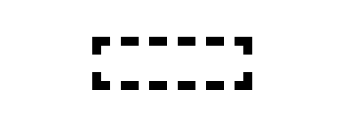
:empty 伪类
div元素为空就会匹配:empty伪类,呈现出虚线框
1 | <div class="cs-empty"></div> |
1 | .cs-empty:empty{ |
隐藏空元素
在动态列表之类,如果没有加载出来前,会因为margin之类的存在大量空白,可通过该方式隐藏
1 | .cs-module:empty { |
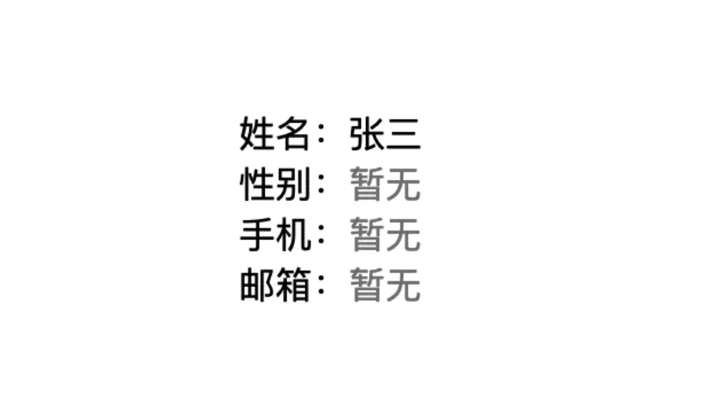
字段缺失智能提示
1 | <dl> |
1 | dd:empty::before { |
数据为空提示
搜索数据为空时之类的场景可以使用
1 | .cs-module:empty::before{ |
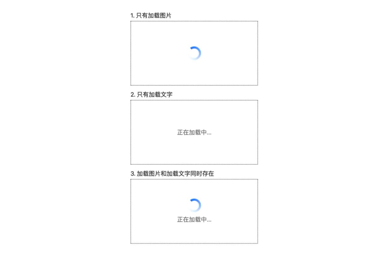
:only-child伪类
1 | <!-- 1. 只有加载图片 --> |
1 | .cs-loading { |
三角形
1 | /** 正三角 */ |
虚线效果
具体的虚线的颜色和间距都可以通过repeating-linear-gradient生成的条纹背景去调整

1 | .dotted-line{ |
文本超出省略号
单行省略

1 | .single-ellipsis{ |
多行文本

1 | .multiline-ellipsis { |
扩展: -webkit-line-clamp 是一个 不规范的属性(unsupported WebKit property),它没有出现在 CSS 规范草案中。
时间轴

1 | <div class="timeline-content"> |
1 | /** 时间轴 */ |
calc()函数 用来计算css属性的值。
1 | /** 属性:calc(expression)*/ |
滚动条

1 | .scroll-container { |
卡卷效果

1 | .coupon{ |
阴影效果

1 | // 三角形阴影 |
页面全部置灰
特殊时期,需要网站整体置灰时使用。
1 | html { |